Grid Layout widget
Path: Widget Gallery> Basic> Layout
The grid layout is a widget that adds the possibility to configure the spatial relationships among the widgets.
There are several elements associated with the grid layout that can be configured:
- Grid properties
- Rows, Columns Properties
- Cells Properties
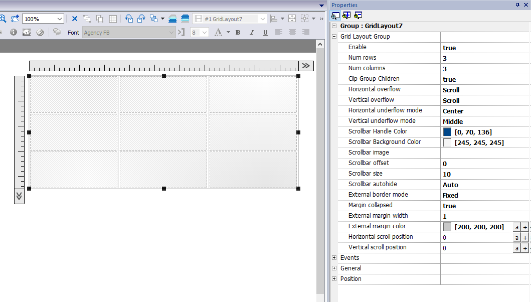
Grid Properties
| Parameter | Description |
|---|---|
| Enable |
Enable the grid layout.
|
|
Num rows |
Number of rows and columns of the grids. Rows and columns can be removed only if their cells are empty . |
| Clip Group Children |
|
| Horizontal overflow Vertical overflow |
This parameter define the behavior of the grid when it is too small to contain all rows and columns.
|
| Horizontal underflow mode Vertical underflow mode |
This parameter defines the behavior of the grid when it is larger than the size defined for the rows and columns
|
|
Scrollbar Handle Color |
Parameters to define look and position of the scroll bars |
| External border mode |
Set the display method of the outer frame.
|
|
Margin collapsed |
Collapse all left-right and top-botton margin using the parameters of the stroke with greater width. |
|
External margin width |
External margin parameters |
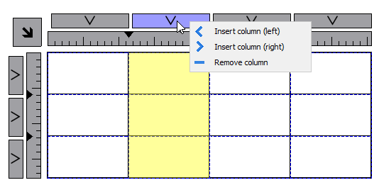
Add or remove rows or columns
To add or remove rows or columns, double click over the grid to enter in edit mode and right click over column or row selector to open the context menu.
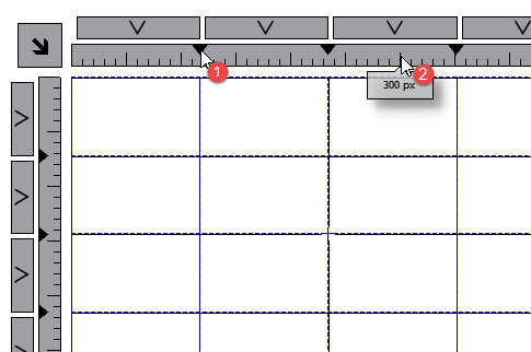
Merge or split rows or columns
To merge or split rows or columns, double click over the grid to enter in edit mode and move the cursor over the ribbons:
- Double click the black triangle to merge the two adjacent rows or columns (1)
Note that merge is possible only with an empty row or column.
- Double click on ribbon to split the selected row or column (2)
Rows, Columns Properties
Row and columns properties are available inside a pop up dialog after clicking on the row and column selectors, that are visible after double clicking the group of widgets.
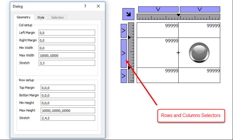
Geometry parameters
| Parameter | Description |
|---|---|
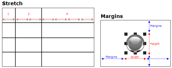
| Left margin Right margin |
Distance of the widget from the border of the cell |
| Min width Max width |
Min/Max width that widget can assume when the cell is stretched |
| Stretch | Defines the relationship between the widths of the columns that will be maintained if the grid is stretched |
| Top margin Bottom margin |
Distance of the widget from the border of the cell |
| Min height Max heighty |
Min/Max height that widget can assume when the cell is stretched |
| Stretch | Defines the relationship between the heights of the rows that will be maintained if the grid is stretched |
Style parameters
| Parameter | Description |
|---|---|
|
Left stroke width |
Strokes width |
| Left stroke color Right stroke color Top stroke color Bottom stroke color |
Strokes color |
| Background color | Row background color |
The list of values that are separated by a comma, are related to rows and columns. Example, the first value is for row 0, the second value for row 1, and so on.
Color format could be #rrggbb or #rrggbbaa, where "aa" is the alpha value which defines the opacity of the color.
Selection parameters
The selection parameters is available only when the grid is used inside a Table Widget (see "Table widget" for details)
| Parameter | Description |
|---|---|
| Forground color Background color Stroke color |
Colors that the row assume when it is selected The list of colors is related with row templates. First color is for row template 0, second color is for row template 1, and so on. |
Cells Properties
Properties of a single cell are available inside the properties panel when a cell is selected. To select a cell: first double click the widget group, then click the cell to select.
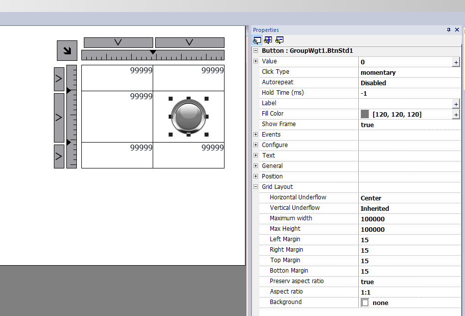
| Parameter | Description |
|---|---|
| Horizontal underflow Vertical underflow |
This parameter defines the behavior of the widget when the cell is larger than the size defined for widget.
|
| Max width Max height |
Overwrite global grid parameters |
| Left margin Right margin Top margin Bottom margin |
Overwrite global grid parameters Additional pixels that are added to the total margin. |
| Preserve aspect ratio | Preserve aspect ration of the widget |
| Aspect ratio | Available only when "Preserve aspect ratio" is true |
| Background | Background color of cell |
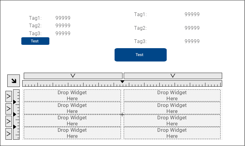
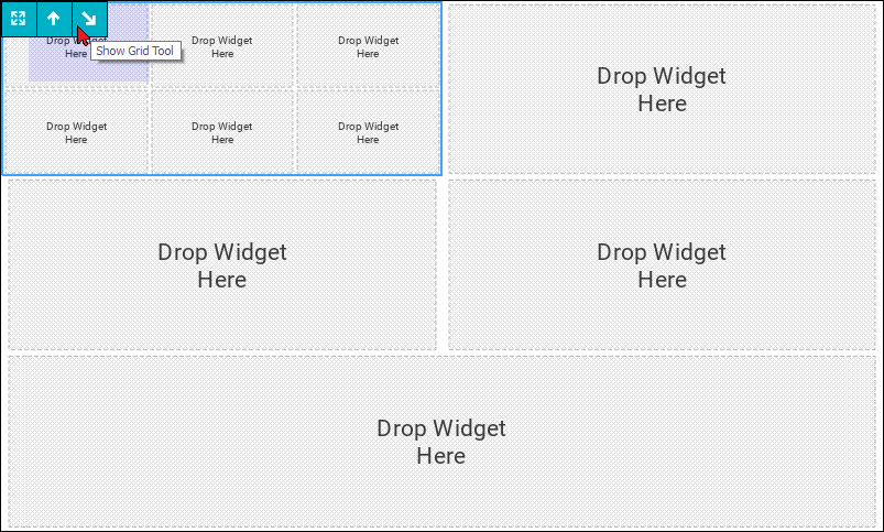
Add widgets inside the Grid Layout
To add a widget inside a cell of the Grid layout, double click the Grid Layout to enter in edit mode and drag and drop the widgets inside the cells.
Dashboard
The dashboards that are associated with the pages are special Grid Layouts where you can drag and drop widgets inside the cells without the need for a double click to enable the edit mode. Use the toolbars to show the grid properties or to move between the nested grids.
Printing report
Note the grid layout is available even inside the print report gallery.